
My Contributions
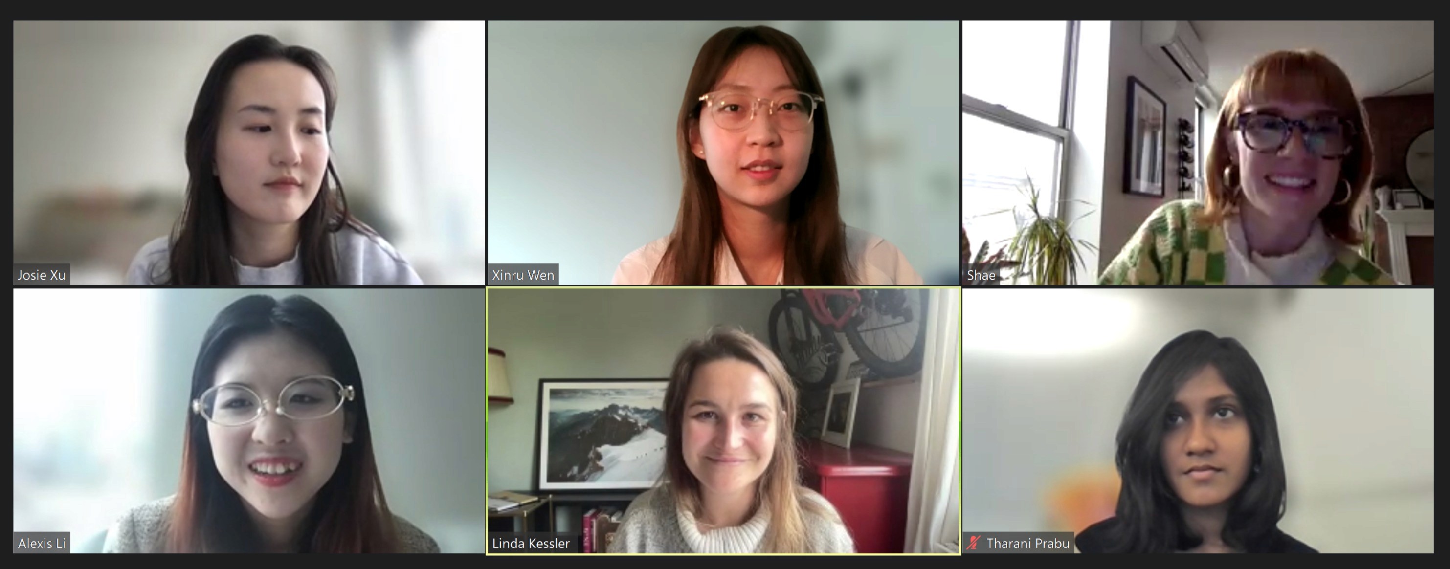
As a UX Researcher, I teamed up with 4 postgraduates from Pratt Institute. I was entirely engaged in the comprehensive recruitment and usability testing process.
Conducted 6 usability tests. Compiled situations & tasks, post-examination survey, post-activity questionnaire, and formulated findings and suggestions.
Duration
Duration
4 months, 2023.03
Client
Client
Knowunity
Tools
Tools
Figma /Zoom / Google Workspace
Team:
Team:
Xinru, Josie, Shae, Alexis, Tharani
About
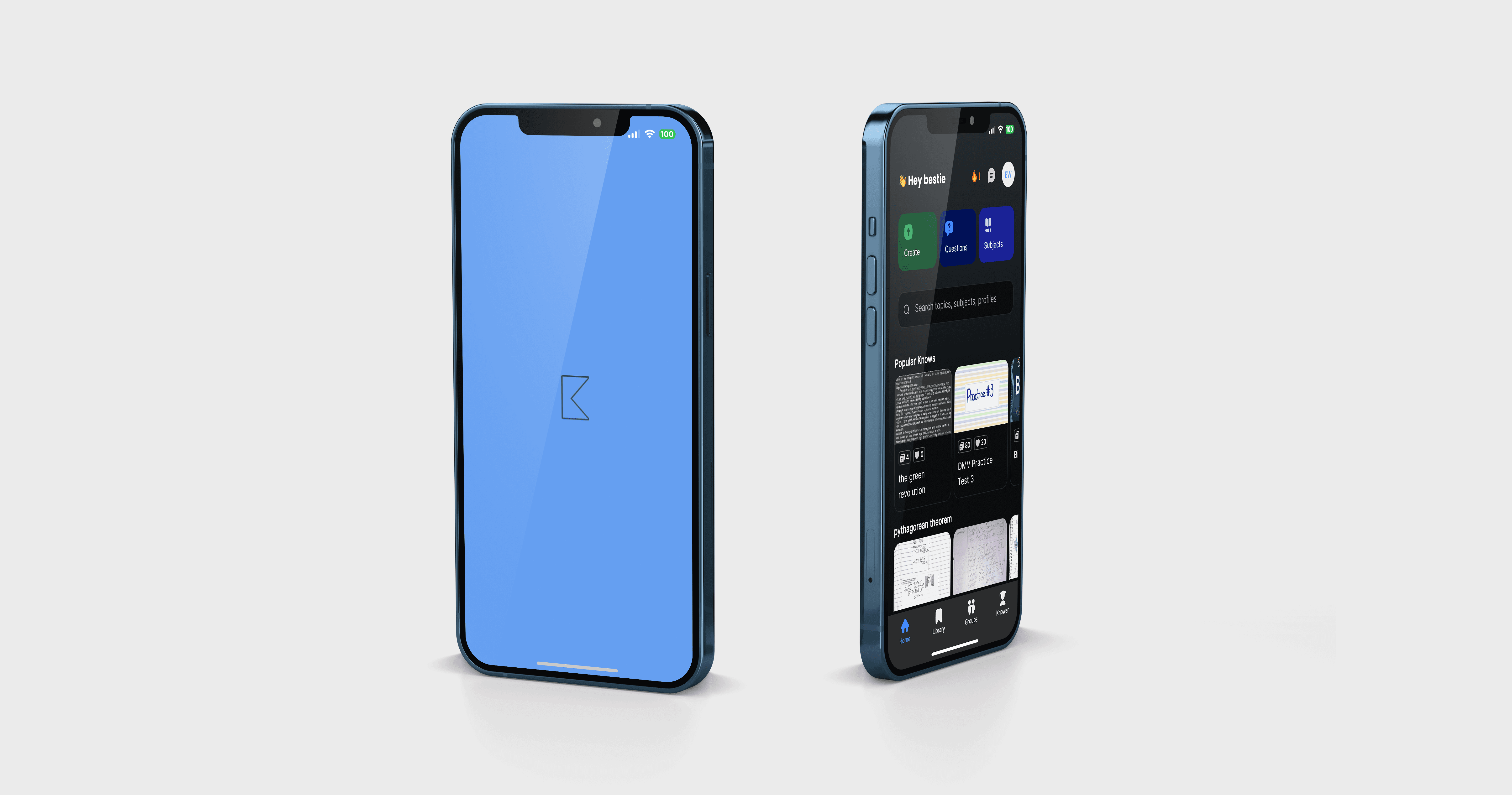
Knowunity is an innovative digital learning platform with user-generated, verified content covering various school subjects. . It serves not only as a platform for learning but also as a social network that enables users to communicate with other students nationwide and improve their academic abilities. As Europe's fastest-growing EdTech startup, it's making a significant impact in education. It's an excellent resource for high school students. We recruited participants for usability testing, analyzed feedback, identified issues, and provided recommendations for improvement.
View Report
Goals
Knowunity targets students between the ages of 12 and 20 in Europe. In April 2023, Knowunity launched its U.S. version, which caters to high school students in grades 9 through 12. This usability study aims to evaluate and enhance overall usability and gauge perception among high school students in the U.S. for the Knowunity mobile application
Knowunity targets students between the ages of 12 and 20 in Europe. In April 2023, Knowunity launched its U.S. version, which caters to high school students in grades 9 through 12. This usability study aims to evaluate and enhance overall usability and gauge perception among high school students in the U.S. for the Knowunity mobile application
Knowunity targets students between the ages of 12 and 20 in Europe. In April 2023, Knowunity launched its U.S. version, which caters to high school students in grades 9 through 12. This usability study aims to evaluate and enhance overall usability and gauge perception among high school students in the U.S. for the Knowunity mobile application
View Report
Define
- Kick off meeting - Define the Problem
Define
- Kick off meeting - Define the Problem
Define
- Kick off meeting - Define the Problem
Prepare
- Write up the script - Set up the test - Recruit participants - Conduct the test
Prepare
- Write up the script - Set up the test - Recruit participants - Conduct the test
Prepare
- Write up the script - Set up the test - Recruit participants - Conduct the test
Analysis
- Quantitative& Qualitative analysis - Findings & Recommendations
Analysis
- Quantitative& Qualitative analysis - Findings & Recommendations
Analysis
- Quantitative& Qualitative analysis - Findings & Recommendations
Deliverable
- Presentation - Report
Deliverable
- Presentation - Report
Deliverable
- Presentation - Report
Methodology
This study carried out by our team of five usability experts involved four steps:
Preparation
Participant recruitment
Data collection and analysis
Praparation
Kickoff Meeting
During the first meeting with the client, Knowunity, the following objectives and outcomes were outlined for the study
Identifying usability issues in the platform’s mobile application ahead of its launch in the U.S.
Checking whether icons, buttons, labels, etc. were relevant to high school students in the U.S.
Feedback on what aspects or user flows of the product could be made better
Specification of aspects that may not work, along with explanations regarding why they may not work
Recommendations to improve any issues found
Materials
Outlining study objectives and requirements
Identification of ideal user groups
Creation of scenarios and tasks
Consent form
Pre-test questionnaire
Post-task questionnaire
Post-test questionnaire
Tasks
1
You have a lot of great notes from school that you’d like to share with other students. How would you go about sharing them on the platform?
2
You are preparing for your AP Chinese exam. Look up content on Chinese Geography and capture it so you can refer back to it later.
3
You are looking for a note on the topic of “Late Modernism”. When you find it, get in contact with the person who posted it to say thank you.
Recuritment
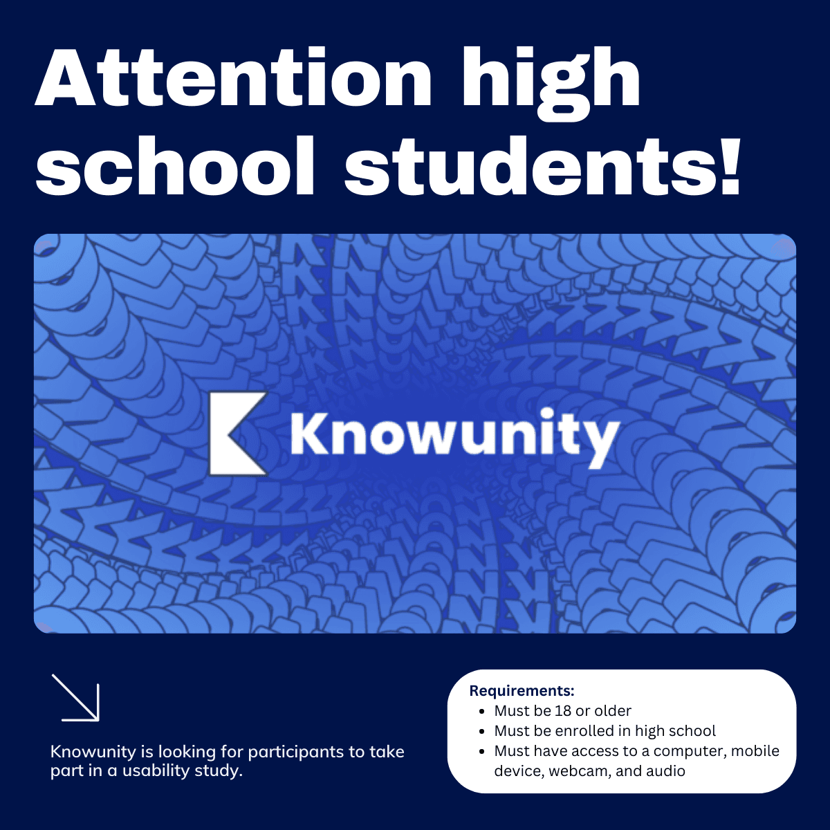
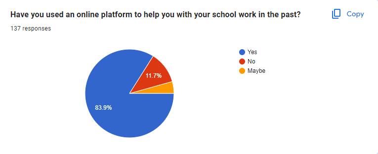
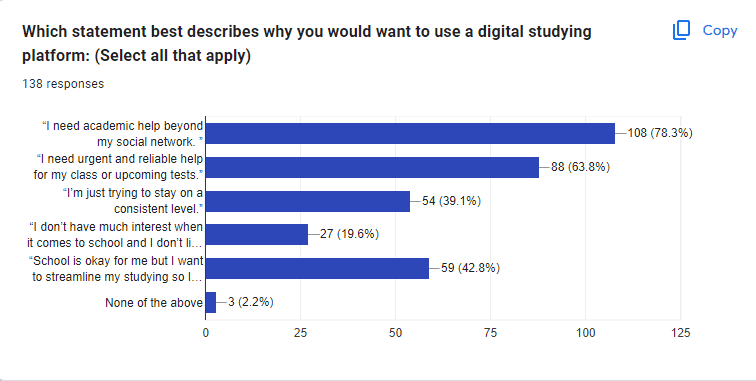
Since the platform under study caters to high school students, the participants for this study were required to be currently enrolled in a high school in the US, and also be above the age of 18 due to legal restrictions. In order to find eligible participants, a screener questionnaire was created with Google Forms and shared on various social media platforms.
Since the platform under study caters to high school students, the participants for this study were required to be currently enrolled in a high school in the US, and also be above the age of 18 due to legal restrictions. In order to find eligible participants, a screener questionnaire was created with Google Forms and shared on various social media platforms.

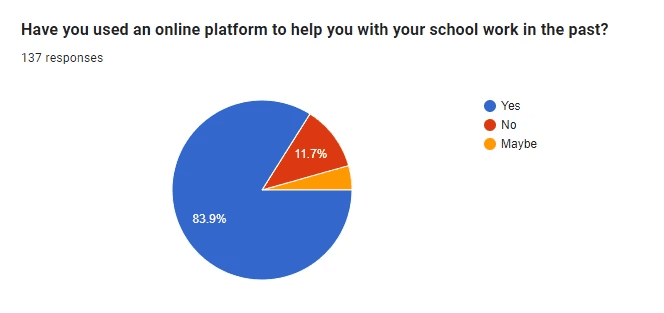

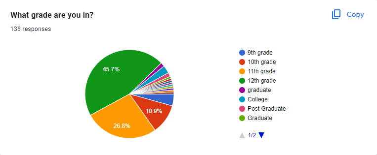
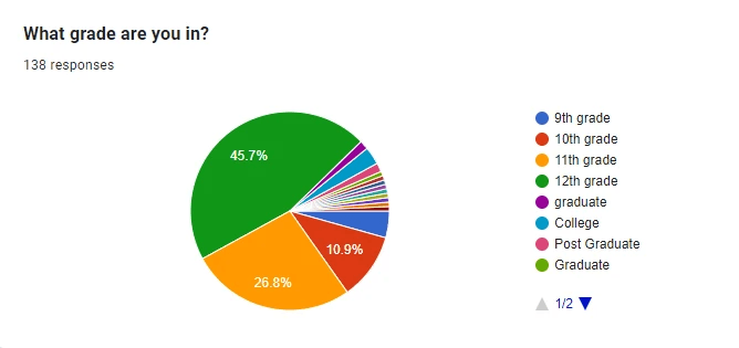

User Profile
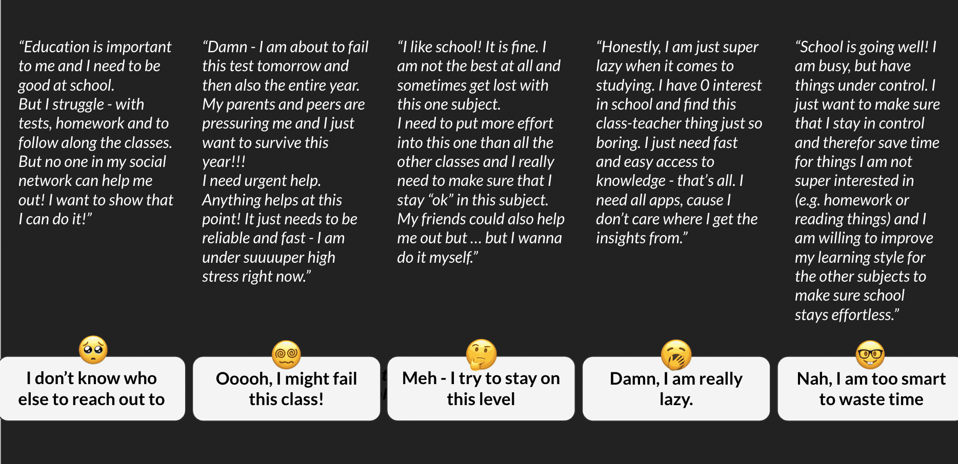


Data Analysis
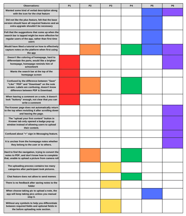
Observations of issues and difficulties faced during sessions were recorded in a rainbow spreadsheet, in which all participants were assigned a column and color, and individual cells corresponding to an issue or difficulty were shaded in the assigned color if a participant experienced that issue or difficulty. The issues that were experienced by the most number of participants were identified and focused on, and recommendations were provided to potentially resolve these issues. Analysis of all this data led to four usability issues being highlighted as focus areas for improvement.
Observations of issues and difficulties faced during sessions were recorded in a rainbow spreadsheet, in which all participants were assigned a column and color, and individual cells corresponding to an issue or difficulty were shaded in the assigned color if a participant experienced that issue or difficulty. The issues that were experienced by the most number of participants were identified and focused on, and recommendations were provided to potentially resolve these issues. Analysis of all this data led to four usability issues being highlighted as focus areas for improvement.

Insights
In general, the overall key usability problem was:
Consolidate and clarify buttons on the notes page.
Make the coloring of the homepage customizable.
Provide an on-demand tutorial for users on how to use the features of the app.
Enable users to upload note photos from albums with a user-friendly editing process.
Add a drop-down menu with options to "Edit" and "Replace" when scanning documents.
Add the input box to the comment function.
Recommendation 1
Consolidate and Clarify Buttons on the Notes Page
“ I'm confused by the buttons on the bottom of the Note screen, it seems like they all do the same thing? ”
“ I'm confused by the buttons on the bottom of the Note screen, it seems like they all do the same thing? ”
“ I'm confused by the buttons on the bottom of the Note screen, it seems like they all do the same thing? ”
The Problem
The Problem
The Problem
Half of the participants were confused about the icons and their corresponding labels on the Notes page.
Challenging to differentiate between the buttons and their functions.
The Problem
Half of the participants were confused about the icons and their corresponding labels on the Notes page.
Challenging to differentiate between the buttons and their functions.
Half of the participants were confused about the icons and their corresponding labels on the Notes page.
Challenging to differentiate between the buttons and their functions.
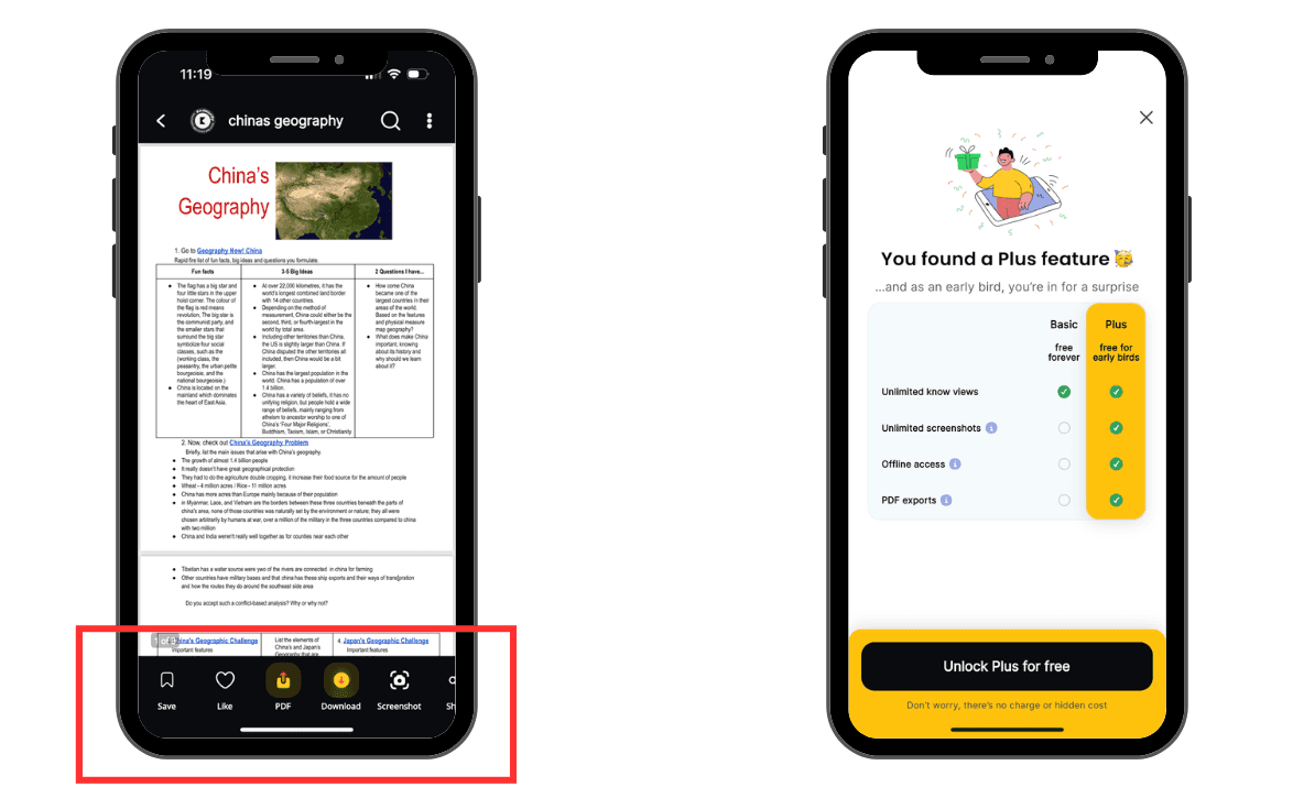

Figure 1: Note screen with current buttons Figure 2: Plus feature pop-up that appears when“Download” was clicked
Figure 1: Note screen with current buttons Figure 2: Plus feature pop-up that appears when“Download”was clicked
Figure 1: Note screen with current buttons Figure 2: Plus feature pop-up that appears when“Download” was clicked
The Recommendation
The Recommendation
The Recommendation
Consolidate the current buttons at the bottom of the Note screen into four distinct buttons that expand to a pop-up with more descriptive labels
Consolidate the current buttons at the bottom of the Note screen into four distinct buttons that expand to a pop-up with more descriptive labels
Consolidate the current buttons at the bottom of the Note screen into four distinct buttons that expand to a pop-up with more descriptive labels
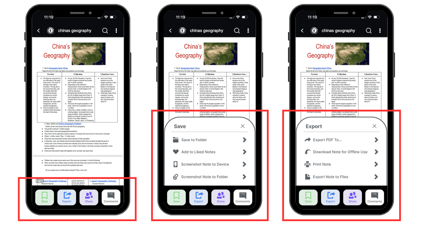

Figure 3: Notes page with updated consolidated buttons and new labels
Figure 3: Notes page with updated consolidated buttons and new labels
Figure 3: Notes page with updated consolidated buttons and new labels
Recommendation 2
Make the Coloring of the Homepage Customizable
“The homepage reminds me of boring, bland, schoolwork”
“The homepage reminds me of boring, bland, schoolwork”
“The homepage reminds me of boring, bland, schoolwork”
The Problem
The Problem
The Problem
1/3 of the participants expressed their dislike for the coloring of the homepage
Challenging to differentiate between the sections
1/3 of the participants expressed their dislike for the coloring of the homepage
Challenging to differentiate between the sections
1/3 of the participants expressed their dislike for the coloring of the homepage
Challenging to differentiate between the sections
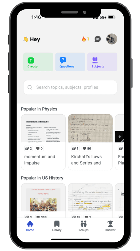

Figure 4: Current Knowunity application homepage
Figure 4: Current Knowunity application homepage
Figure 4: Current Knowunity application homepage
The Recommendation
The Recommendation
The Recommendation
Offer users the ability to customize the appearance of their Knowunity application by accessing their user profile page
Offer users the ability to customize the appearance of their Knowunity application by accessing their user profile page
Offer users the ability to customize the appearance of their Knowunity application by accessing their user profile page
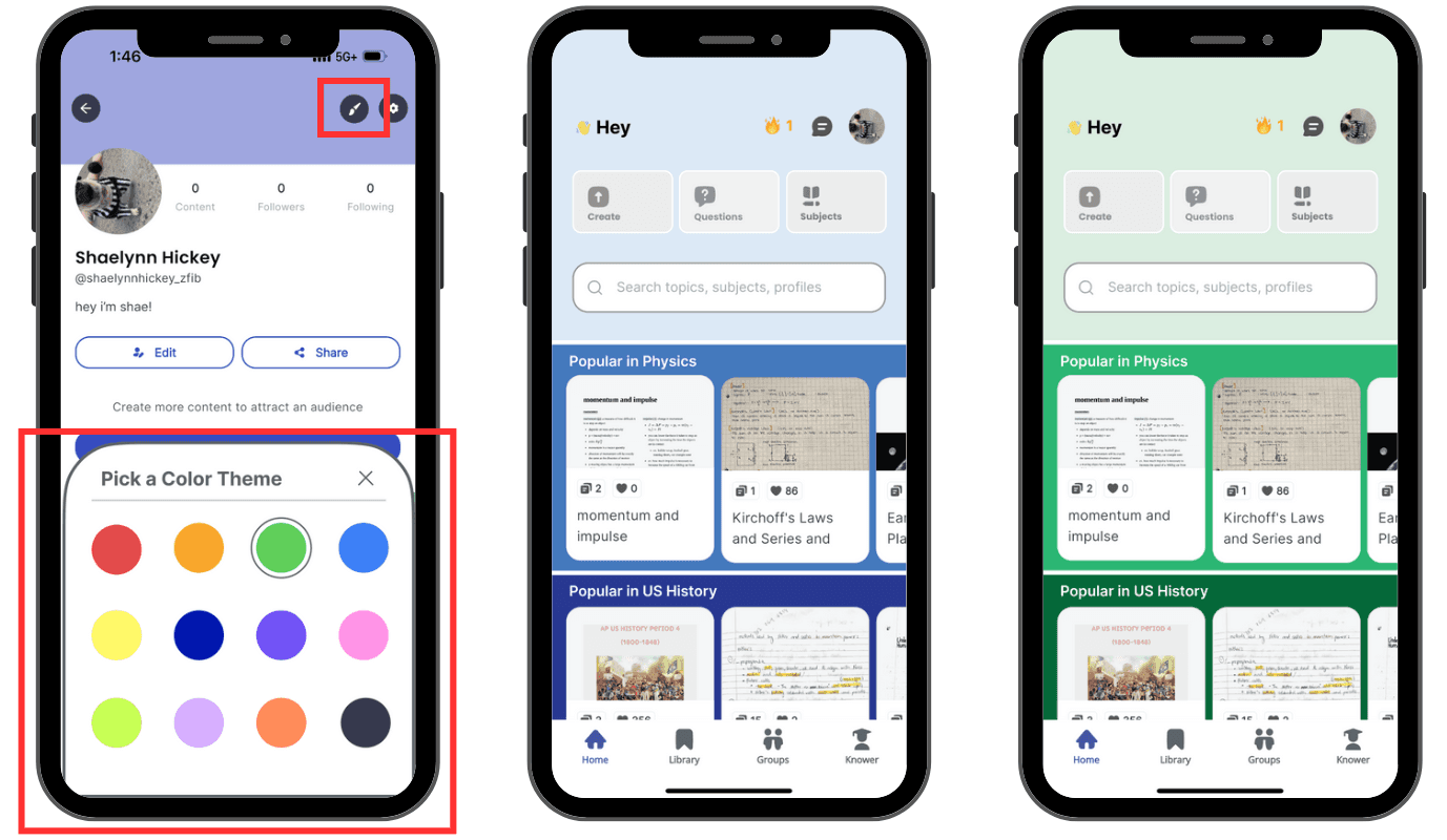

Figure 5: Updated user profile page with customization color options and updated colorful homescreens
Figure 5: Updated user profile page with customization color options and updated colorful homescreens
Figure 5: Updated user profile page with customization color options and updated colorful homescreens
Recommendation 3
Provide an on-demand tutorial for users on how to use the features of the app
“... maybe the 'capture' feature? I understood it, but I feel like if it was better, maybe explained when like you open the app for the first time and it explains how to capture something, like that would be a lot more helpful.”
“... maybe the 'capture' feature? I understood it, but I feel like if it was better, maybe explained when like you open the app for the first time and it explains how to capture something, like that would be a lot more helpful.”
“... maybe the 'capture' feature? I understood it, but I feel like if it was better, maybe explained when like you open the app for the first time and it explains how to capture something, like that would be a lot more helpful.”
The Problem
The Problem
The Problem
Participants weren't sure how to do certain tasks on the app such as capturing notes for further use
Participants felt that they would like access to a tutorial to help them when they were doubtful about how to carry out a task
Participants weren't sure how to do certain tasks on the app such as capturing notes for further use
Participants felt that they would like access to a tutorial to help them when they were doubtful about how to carry out a task
Participants weren't sure how to do certain tasks on the app such as capturing notes for further use
Participants felt that they would like access to a tutorial to help them when they were doubtful about how to carry out a task
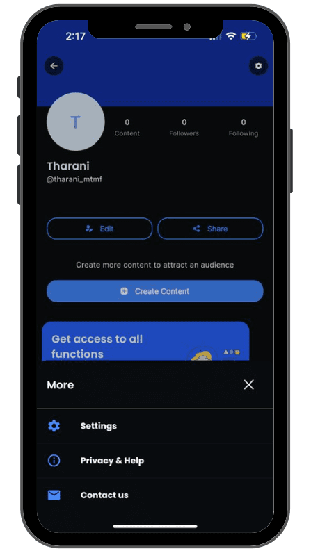

Figure 6: Current Knowunity "Privacy & Help" option
Figure 6: Current Knowunity "Privacy & Help" option
Figure 6: Current Knowunity "Privacy & Help" option
The Recommendation
The Recommendation
The Recommendation
Add an extra 'Tutorial' option under the 'Settings' menu
Display pop-up bubbles containing information about each element on the page, with options to continue or exit the tutorial at any point in time
Options to access the tutorial for the entire app, or the one specific to the page that the user is on
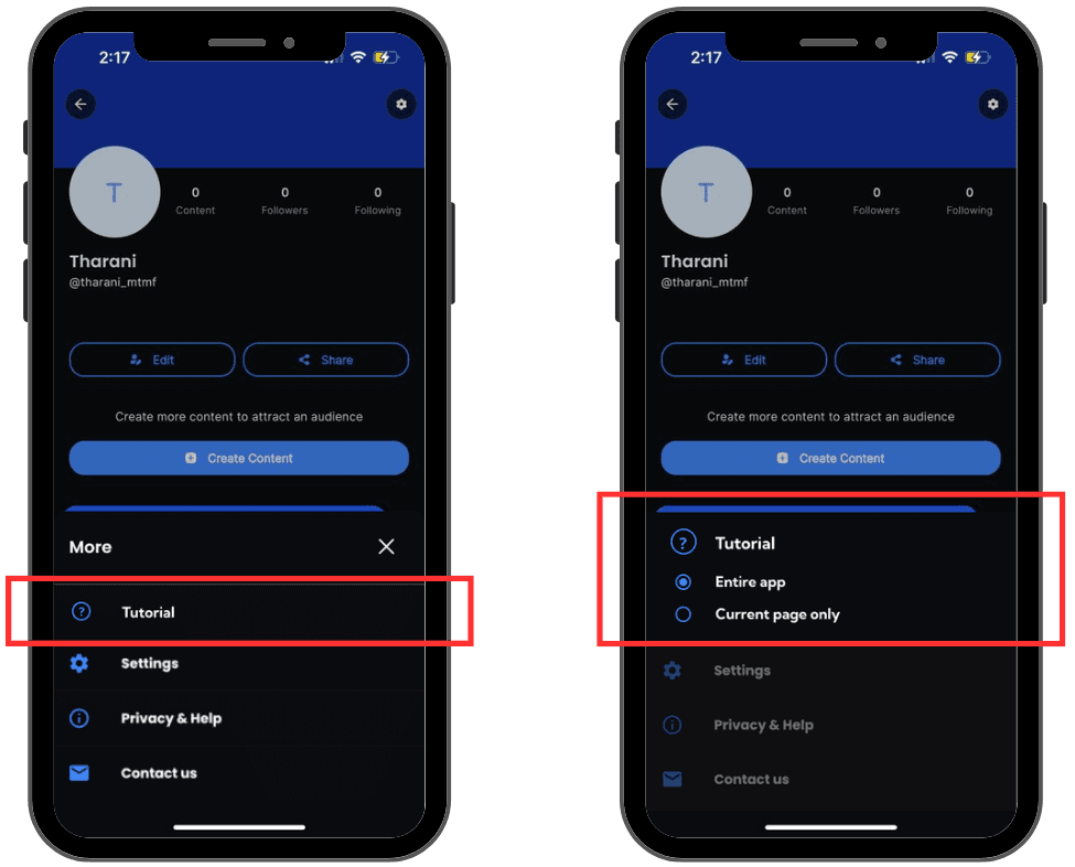

Figure 7: Updated settings menu with a new "Tutorial" option and further options to choose the tutorial needed
Figure 7: Updated settings menu with a new "Tutorial" option and further options to choose the tutorial needed
Figure 7: Updated settings menu with a new "Tutorial" option and further options to choose the tutorial needed
Background and all other elements are grayed out when one element is in focus
The 'Next' arrow skips to the next element, while the 'X' button exits the tutorial
Background and all other elements are grayed out when one element is in focus
The 'Next' arrow skips to the next element, while the 'X' button exits the tutorial
Background and all other elements are grayed out when one element is in focus
The 'Next' arrow skips to the next element, while the 'X' button exits the tutorial
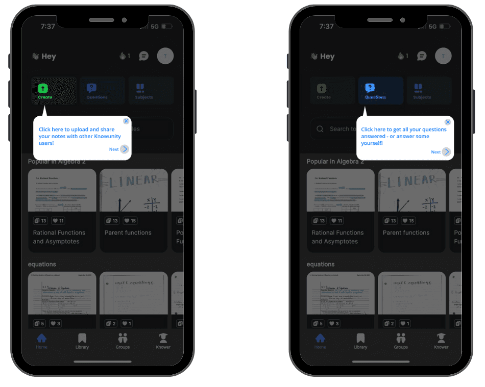

Figure 8: Tutorial screens when the "Entire app" option is selected
Figure 8: Tutorial screens when the "Entire app" option is selected
Figure 8: Tutorial screens when the "Entire app" option is selected
Recommendation 4
Enable users to upload note photos from albums with a user-friendly editing process
“I don’t know how to convert a photo to pdf on mobile.”
“I don’t know how to convert a photo to pdf on mobile.”
“I don’t know how to convert a photo to pdf on mobile.”
The Problem
The Problem
The Problem
Participants cannot upload note photos from their albums when they wanted to upload the notes
Participants didn't know how to scan pdf files from their album photos
Participants weren't sure how to do certain tasks on the app such as capturing notes for further use
Participants felt that they would like access to a tutorial to help them when they were doubtful about how to carry out a task
Participants cannot upload note photos from their albums when they wanted to upload the notes
Participants didn't know how to scan pdf files from their album photos
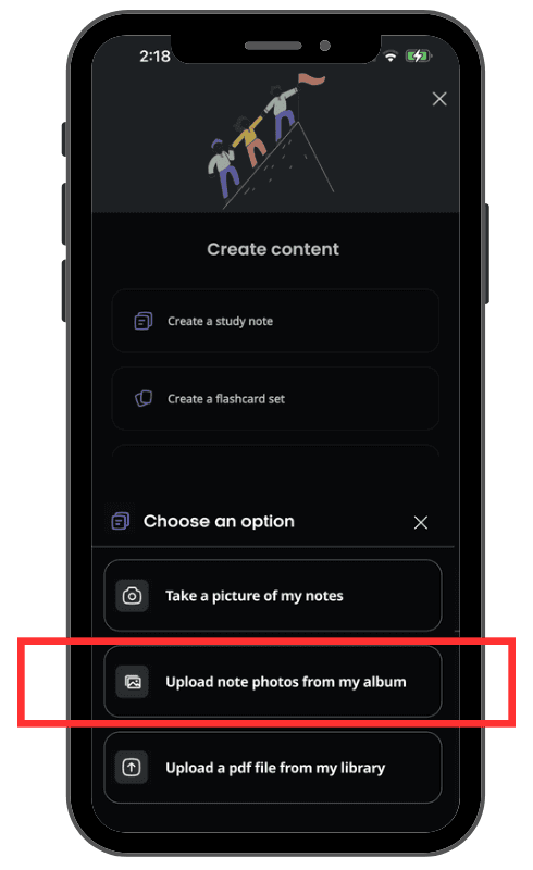

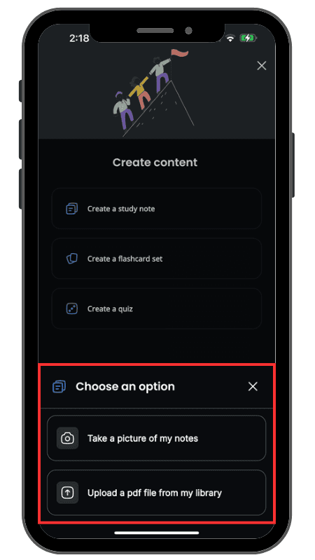

Figure 9: Current Knowunity "Upload Study Notes" page
Figure 9: Current Knowunity "Upload Study Notes" page
Figure 9: Current Knowunity "Upload Study Notes" page
Figure 10: Recommended "Upload Study Notes" page
Figure 10: Recommended "Upload Study Notes" page
Figure 10: Recommended "Upload Study Notes" page
The Recommendation
The Recommendation
The Recommendation
Add a CTA button that allows users to upload note photos from their albums
Have an intuitive editing process
Intuitive selecting and editing image process for users
Allow users to preview and edit if they need to
Add a CTA button that allows users to upload note photos from their albums
Have an intuitive editing process
Intuitive selecting and editing image process for users
Allow users to preview and edit if they need to
Add a CTA button that allows users to upload note photos from their albums
Have an intuitive editing process
Intuitive selecting and editing image process for users
Allow users to preview and edit if they need to
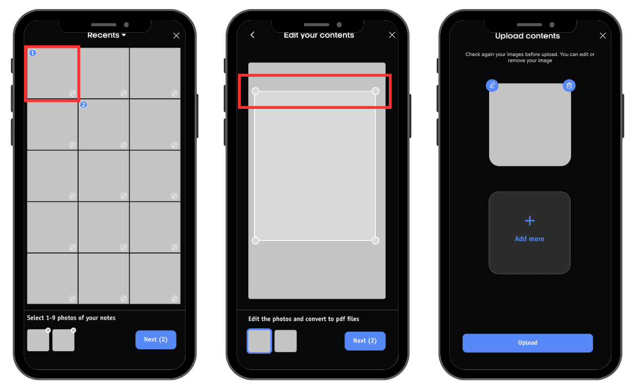

Figure 11: "Select", "Edit contents", and "Preview" pages in uploading notes process
Figure 11: "Select", "Edit contents", and "Preview" pages in uploading notes process
Figure 11: "Select", "Edit contents", and "Preview" pages in uploading notes process
Recommendation 5
Add a drop-down menu with options to "Edit" and "Replace" when scanning documents
“How do I edit a document right before uploading it, if I already missed the cropping document page?”
“How do I edit a document right before uploading it, if I already missed the cropping document page?”
“How do I edit a document right before uploading it, if I already missed the cropping document page?”
The Problem
The Problem
The Problem
Participant was curious about how to edit an image at the last minute before uploading, having missed the cropping step.
The manual cropping method is inconvenient and may result in uneven and unattractive note images.
Participant was curious about how to edit an image at the last minute before uploading, having missed the cropping step.
The manual cropping method is inconvenient and may result in uneven and unattractive note images.
Participant was curious about how to edit an image at the last minute before uploading, having missed the cropping step.
The manual cropping method is inconvenient and may result in uneven and unattractive note images.
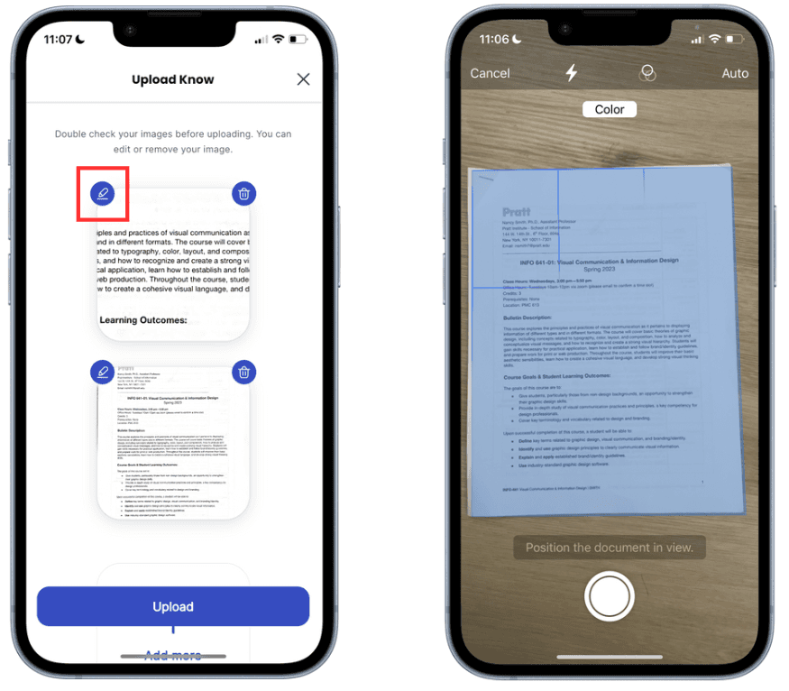

Figure 12: Current Knowunity "Upload Know" page
Figure 12: Current Knowunity "Upload Know" page
Figure 12: Current Knowunity "Upload Know" page
Figure 13: Scanning page
Figure 13: Scanning page
Figure 13: Scanning page
The Recommendation
The Recommendation
The Recommendation
Add on a drop-down menu with options to "Edit" and "Replace"
Added custom cropping options and preset cropping sizes on the editing interface.
Add on a drop-down menu with options to "Edit" and "Replace"
Added custom cropping options and preset cropping sizes on the editing interface.
Add on a drop-down menu with options to "Edit" and "Replace"
Added custom cropping options and preset cropping sizes on the editing interface.
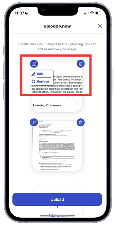

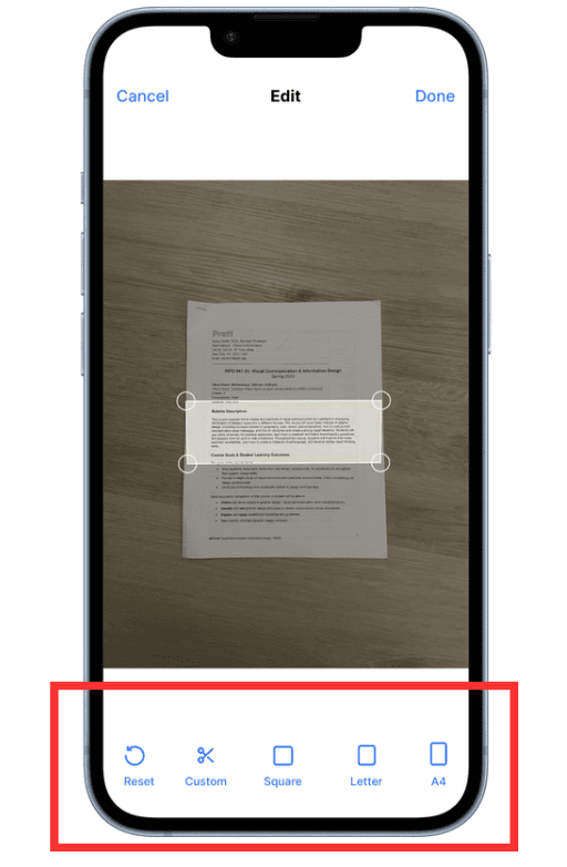

Figure 14: Recommended "Upload Know" page
Figure 14: Recommended "Upload Know" page
Figure 14: Recommended "Upload Know" page
Figure 15: Recommended "Edit" page
Figure 15: Recommended "Edit" page
Figure 15: Recommended "Edit" page
Recommendation 6
Add the input box to comment function
“It doesn't look 'buttony' enough”
“It doesn't look 'buttony' enough”
“It doesn't look 'buttony' enough”
The Problem
The Problem
The Problem
A drop-down arrow to navigate to the commenting screen and simultaneously display the input box, an additional step is added to the commenting process.
No actionable area
A drop-down arrow to navigate to the commenting screen and simultaneously display the input box, an additional step is added to the commenting process.
No actionable area
A drop-down arrow to navigate to the commenting screen and simultaneously display the input box, an additional step is added to the commenting process.
No actionable area
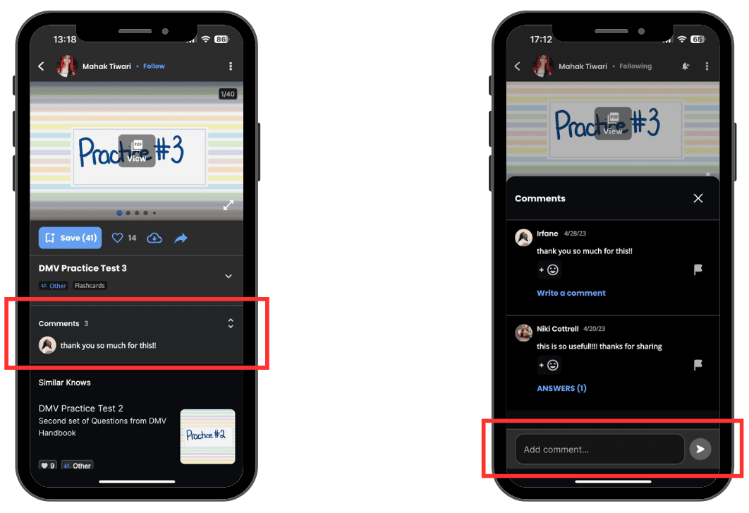

Figure 16: Current Knowunity "Comment" page
Figure 16: Current Knowunity "Comment" page
Figure 16: Current Knowunity "Comment" page
The Recommendation
The Recommendation
The Recommendation
Add Input box under Comments title
Let users notice the actionable area
Enable users who simply want to comment to complete the process quickly and with ease
Add Input box under Comments title
Let users notice the actionable area
Enable users who simply want to comment to complete the process quickly and with ease
Add Input box under Comments title
Let users notice the actionable area
Enable users who simply want to comment to complete the process quickly and with ease
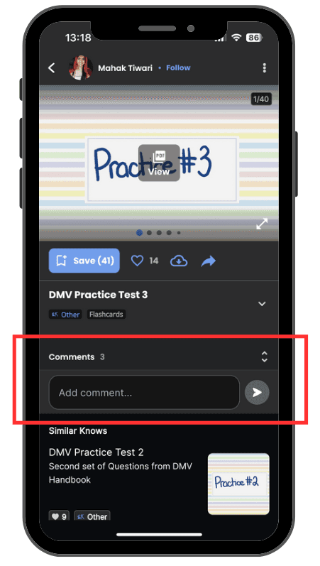

Figure 17: Recommended "Comments" page
Figure 17: Recommended "Comments" page
Figure 17: Recommended "Comments" page
Reflection
We presented the research and analysis to the client and provided a detailed report with findings and recommendations. The client was also presented with a brief presentation and a run-through of the dashboard to share and discuss our analysis and answer their questions about the study. In the end, the presentation was well received by the client.
“Thank you so much for sharing the usability insights in this amazing presentation! It was so cool to learn from you and hear about your findings. ”
“Thank you so much for sharing the usability insights in this amazing presentation! It was so cool to learn from you and hear about your findings. ”
