NYC Parks Website Redesign
Revamp an Instinctive Data Structure & Compelling Mobile-Friendly Web Interaction for NYC Recreation Areas.
My Contributions
As a UX Designer and researcher, I collaborated with two graduate students from Pratt Institute. I was fully involved in the complete user research process and conducted six user interviews. Facilities page, Hi-fi Prototype visual and interaction design, and finalizing filter system.
Research: Questionnaire, User Interview, Competitive Analysis, Affinity Diagram, Card Sorting, Tree Testing, Information Architecture, and Usability Testing.
Design: Sketching, Wireframing, Prototyping, Interaction & Visual Design.
4 months, 2022.09
NYC Parks
Miro /Figma /llustrator /Photoshop /Optimal Workshop
Xinru, Keyi, Sneh, Cici, Bhavna
About
The New York City Department of Parks & Recreation's official website, NYC Parks Website, operates under the guiding principles of increased greening, improved access to recreational and fitness opportunities, and using parks as a vehicle for community and economic development. As a powerful tool to fulfill this vision, our client sought our assistance in revitalizing their current website with the aim of enhancing user engagement and connectivity.
Dual navigation menus lead to user bewilderment.
Insufficient fine-tuned filters for quick park choosing.
Subpar web accessibility functionality, and unavailability of a matching adaptive mobile edition.
Goals
Research
Methodology
We employed Interviewing, Observations, and an Online Survey as research methods. Two parks in different New York boroughs were chosen. Initially, generic questions were posed to grasp visitor types. Observing park-goers, we noted a prevalent presence of people with kids. This led us to tailor specific questions for this demographic, aiming to uncover website shortcomings and desired content.
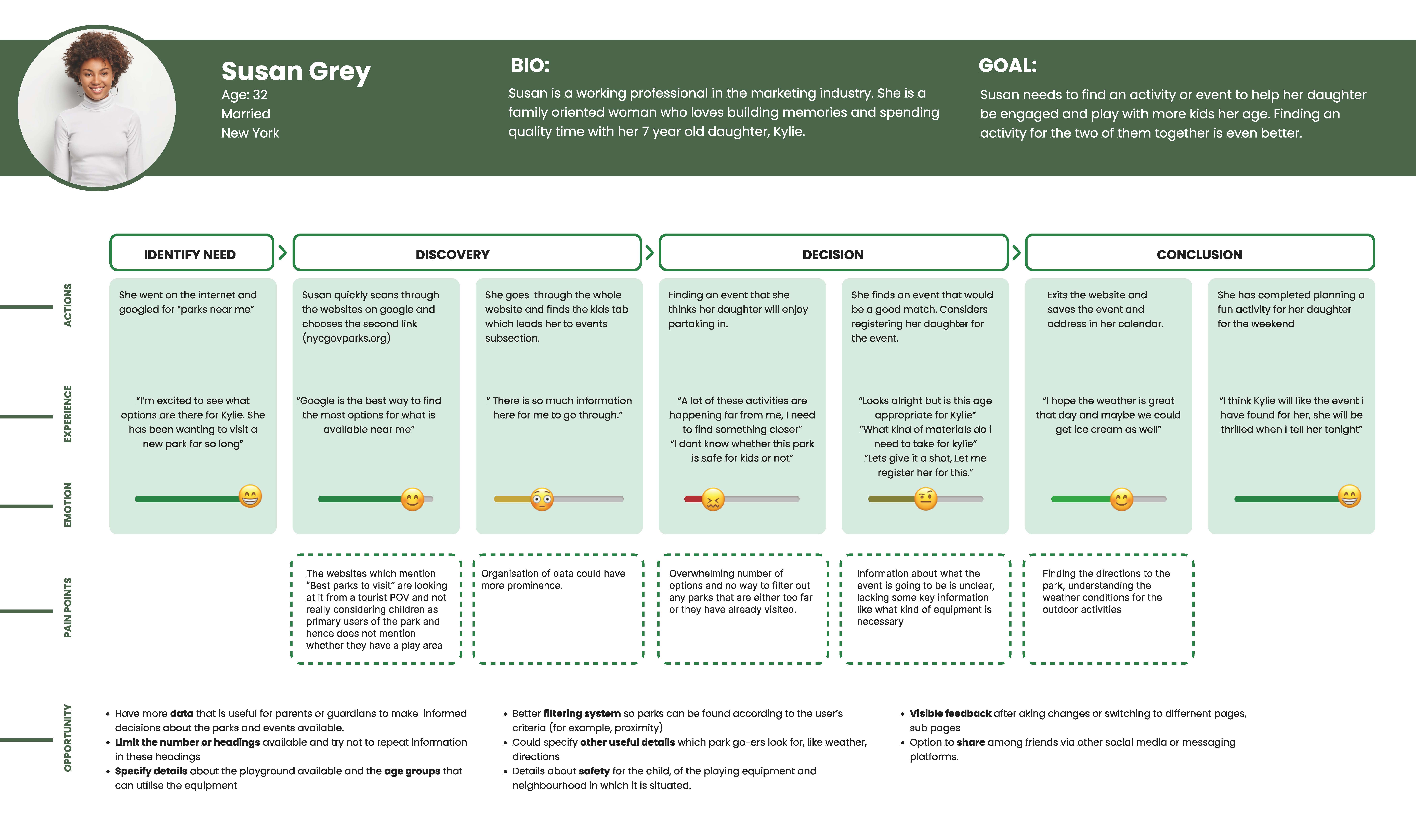
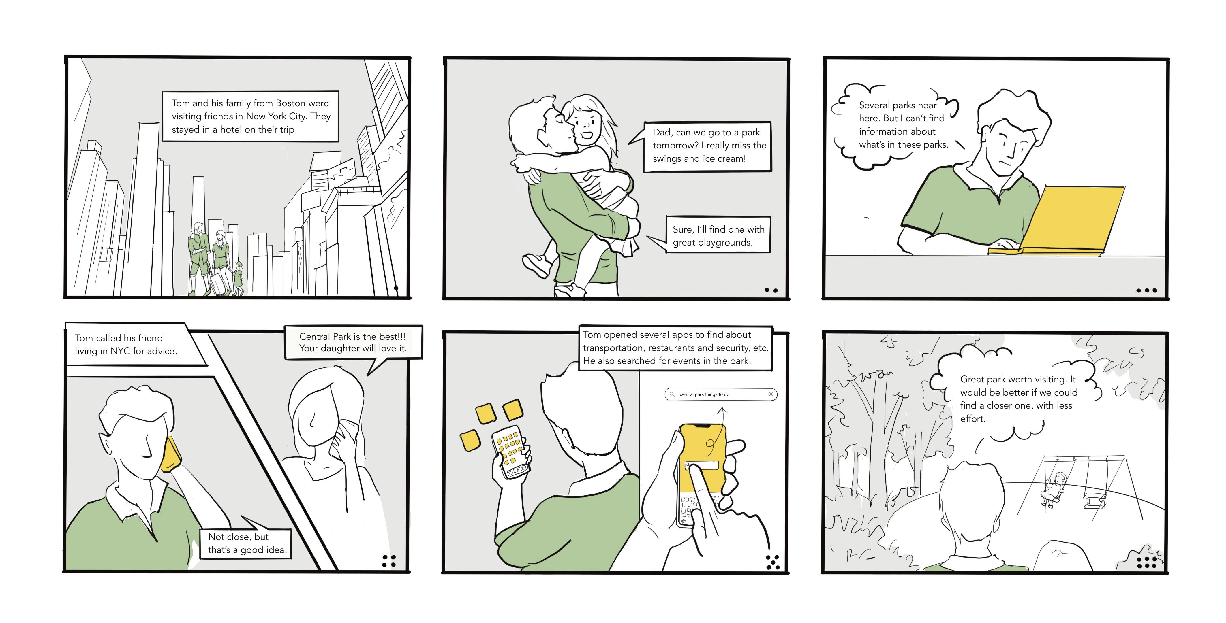
Insights from interviews informed user journey mapping and storyboard, revealing user frustrations, perceptions, and intentions when using the website.
User Group
The focus group we chose to delve deeper into is “People who visit parks with/for kids''. The motivations for people like parents and grandparents were 2 fold in terms of their visit. Their primary motivation was activities for kids and some had a secondary one as well in terms of their own interests which could also involve kids. Nannies and teachers in parks had different sets of emotions and motivations as they were in parks as a part of their jobs, hence kids were the only decision-making factor for their choices.
User Journey Mapping
Storyboard
Insights
Strategy
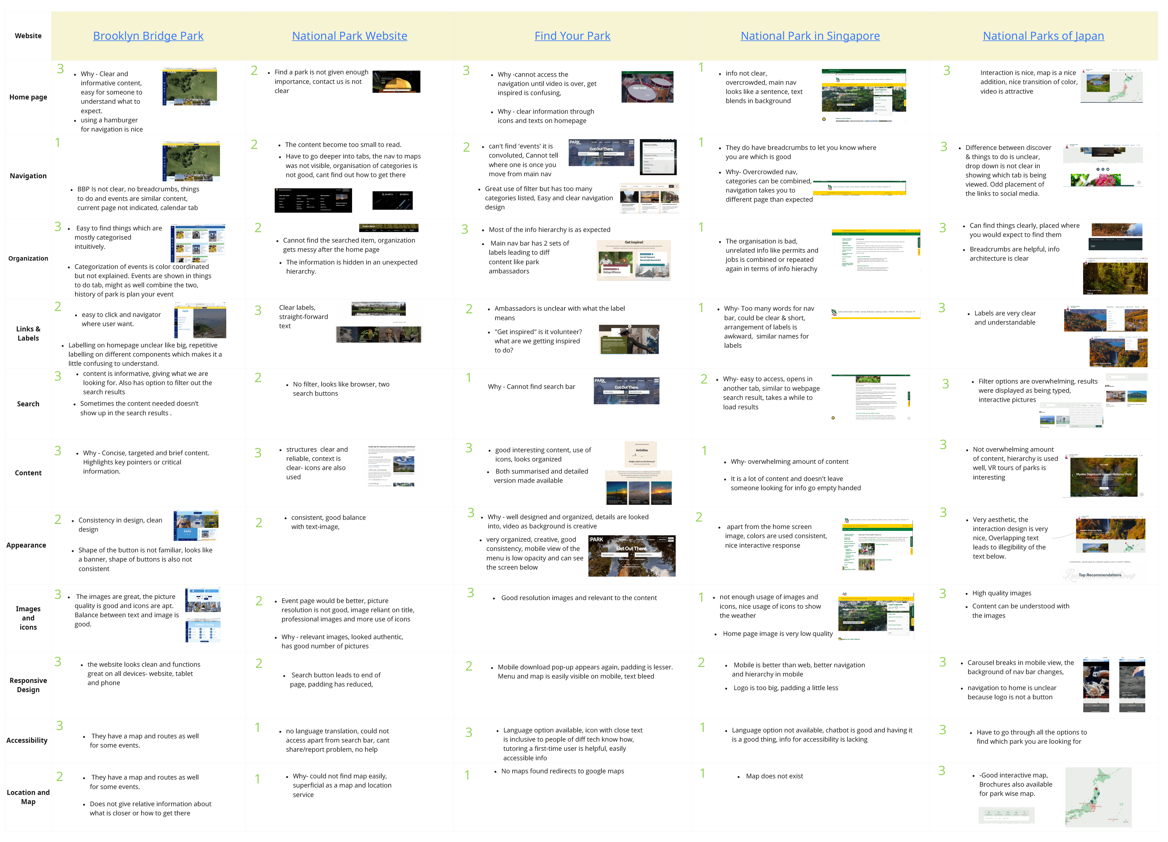
Competitive Analysis
Our team reviewed 5 competitors’ websites in order to establish guidelines for our design by analyzing the pros and cons of each website. Our study evaluated the performance of each competitor site based on their Homepage, Navigation, Organization, Links& labels, Search, Content, Appearance, Images& Icons, Responsive design, Accessibility, Location, and Map.
Site Map Revision
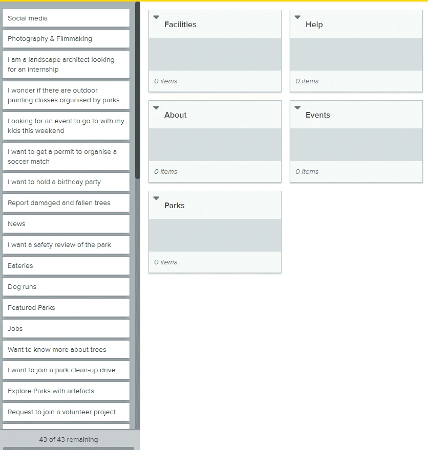
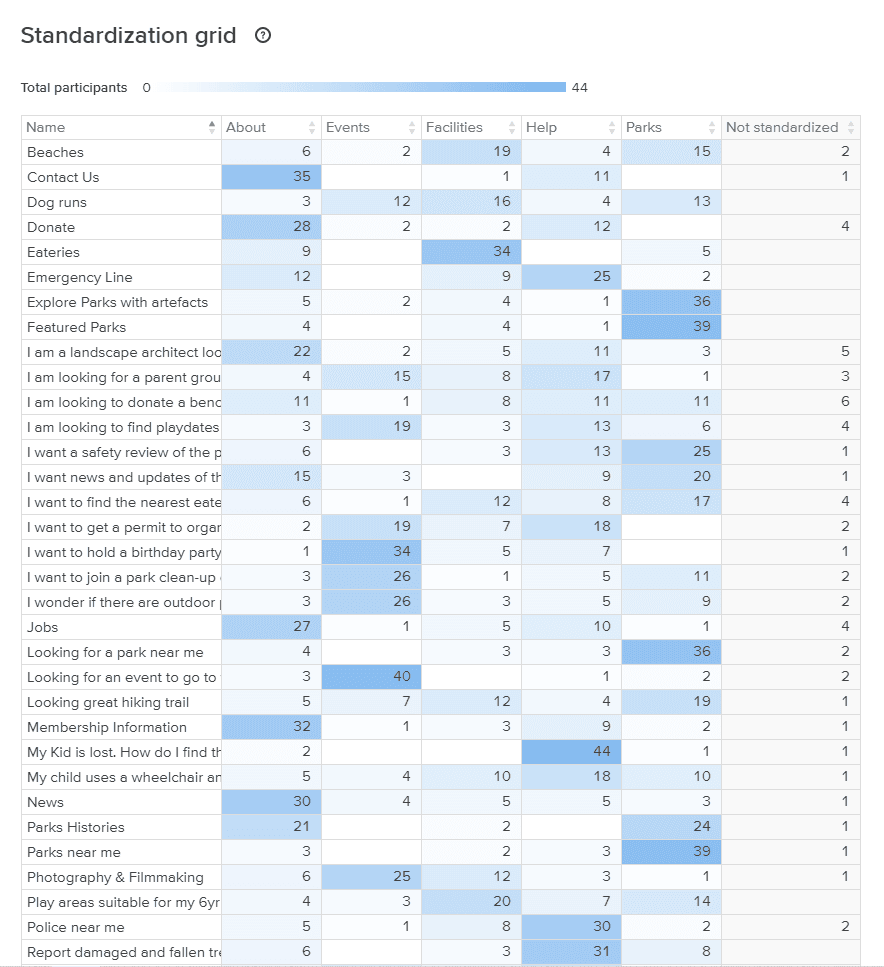
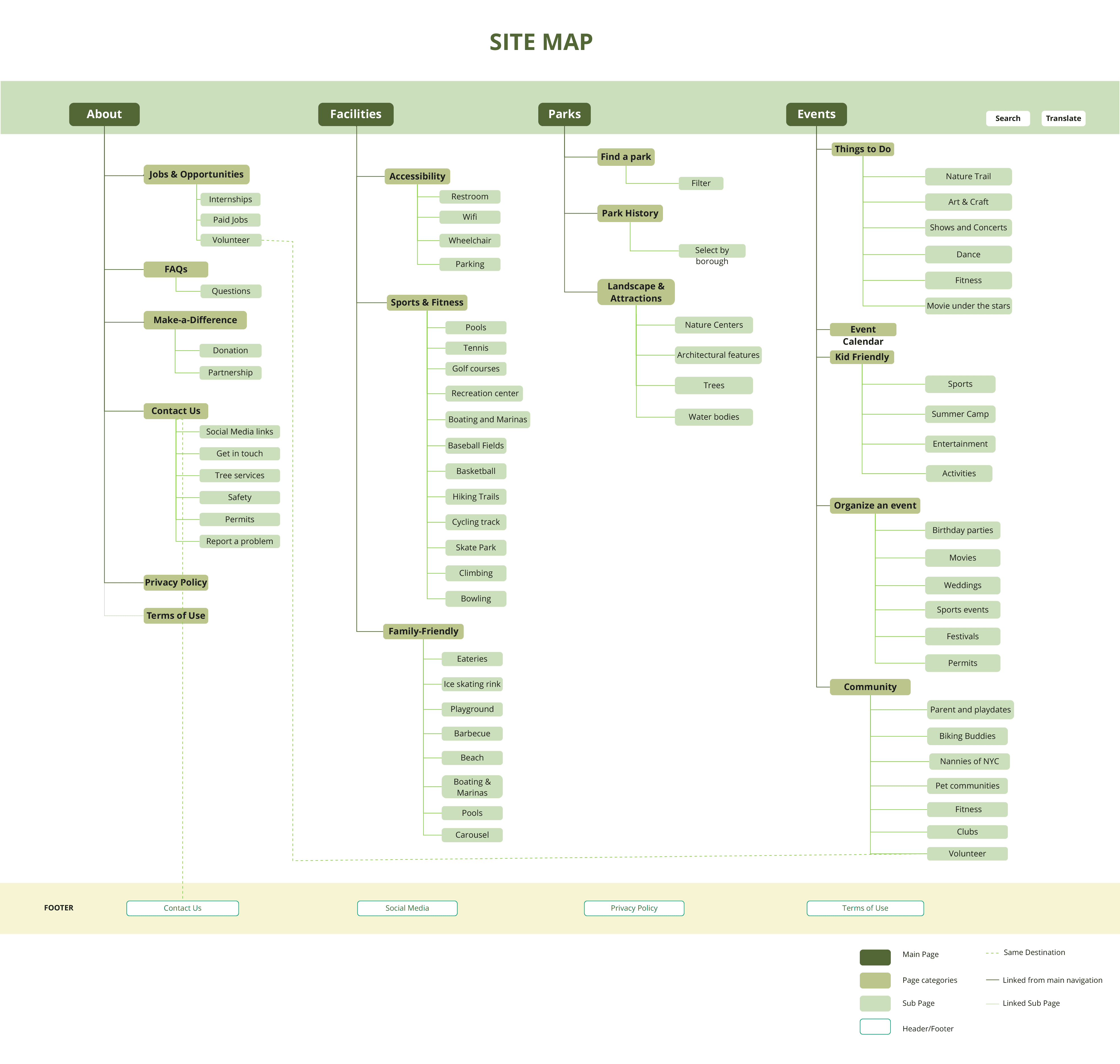
Based on the prior user research, we conducted card sorting to learn how the users grouped categories and labeled them. Afterwards, we conducted tree testing to verify our draft of sitemap which was built based on the card sorting results.
Design
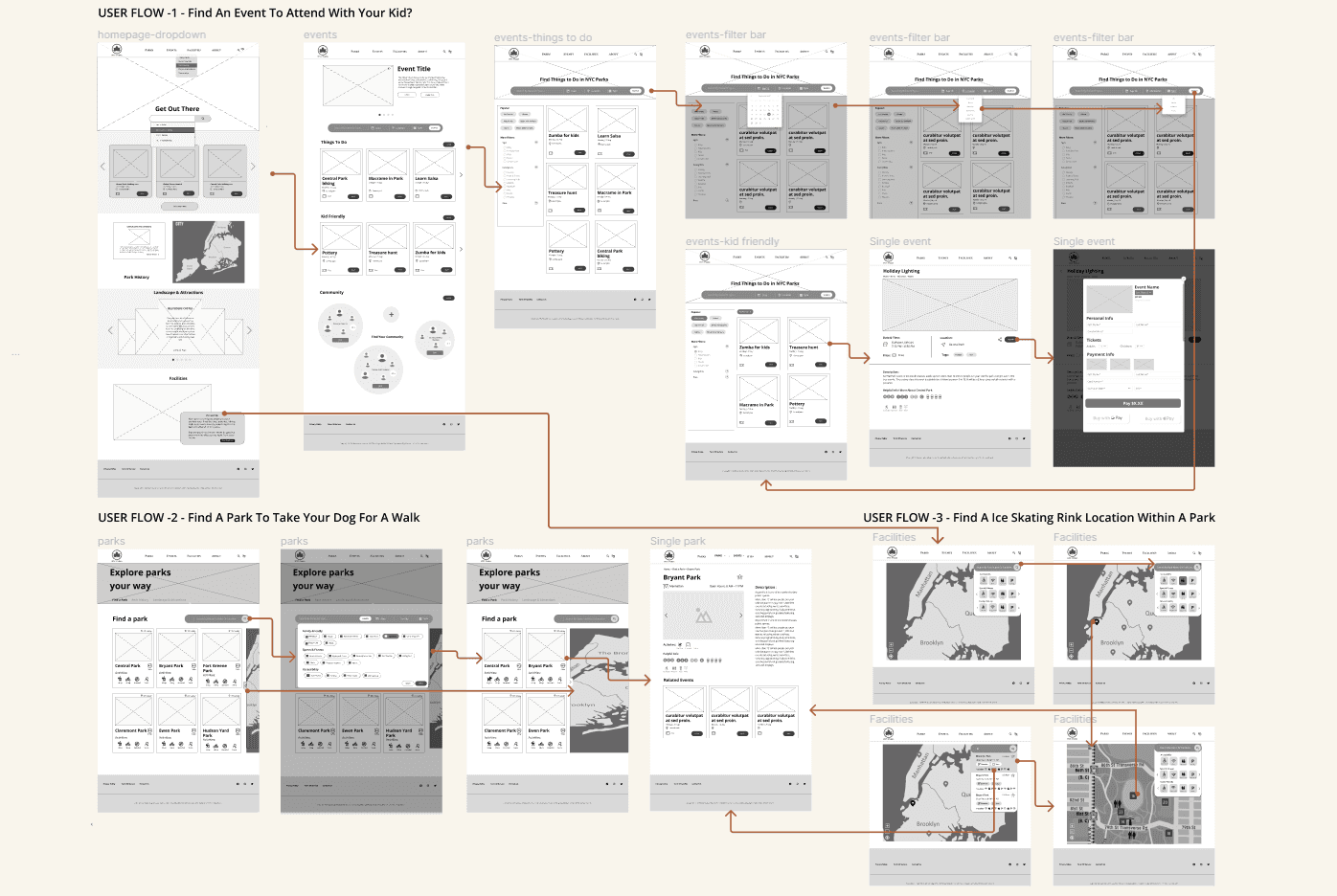
Wireframe
Define Tasks
2. Low-Fi Prototype
User Testing
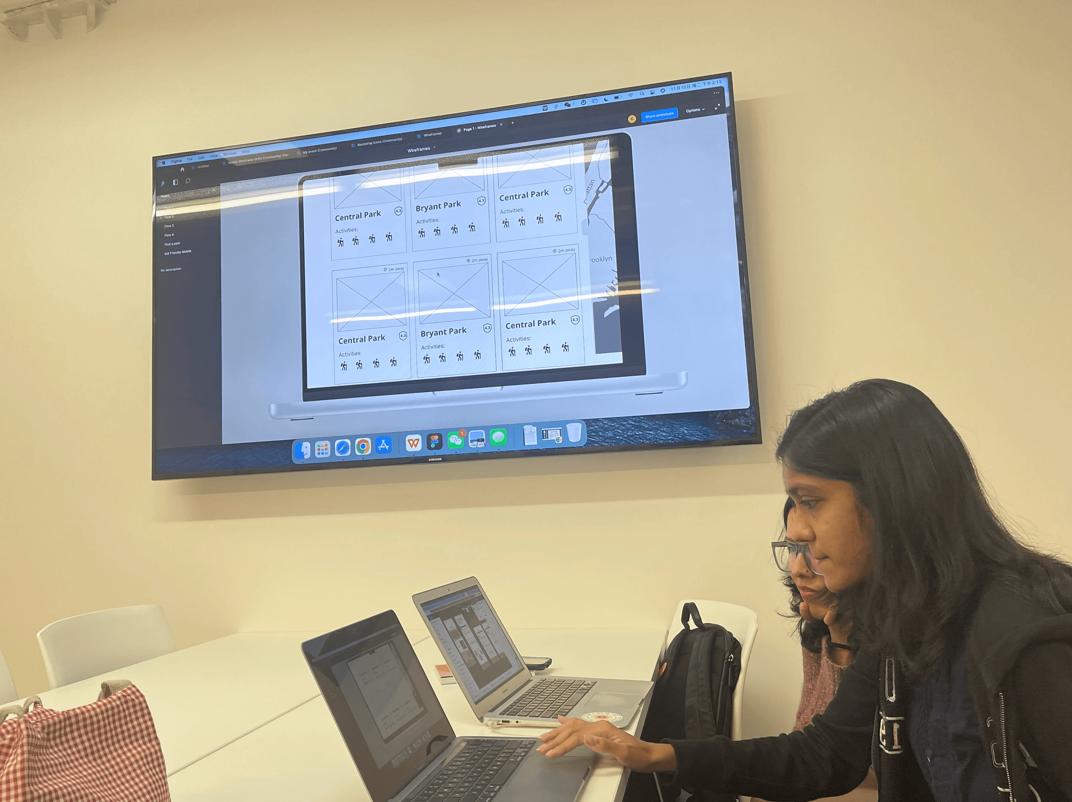
Our team invited a total of 15 participants to conduct user testing.
After test, the participants pointed out that prototype's overall flow was smooth and there were no major logic or usability issues. Based on the feedback and observations, we developed two additional iterations of the prototype before finalizing the design.
Filter System
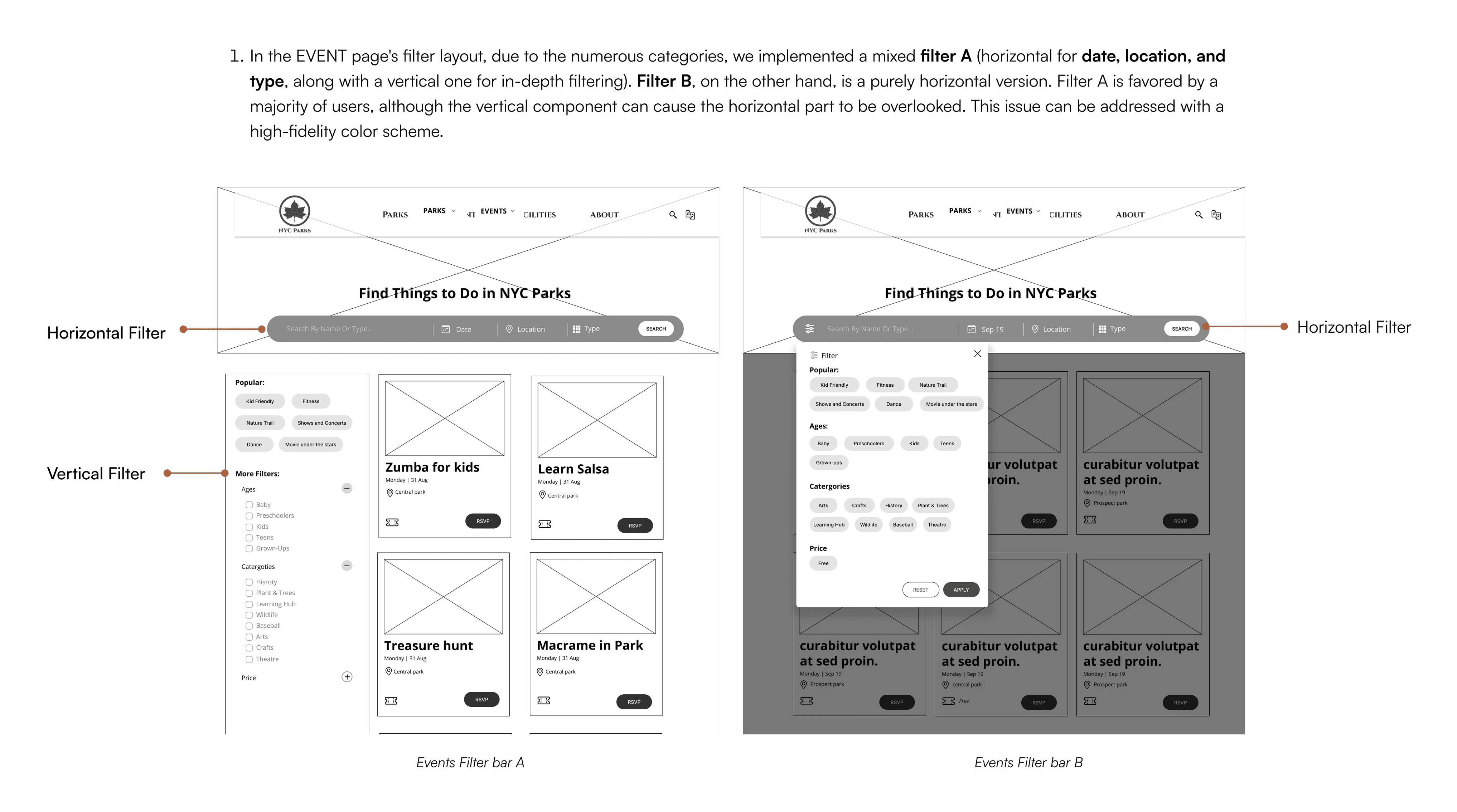
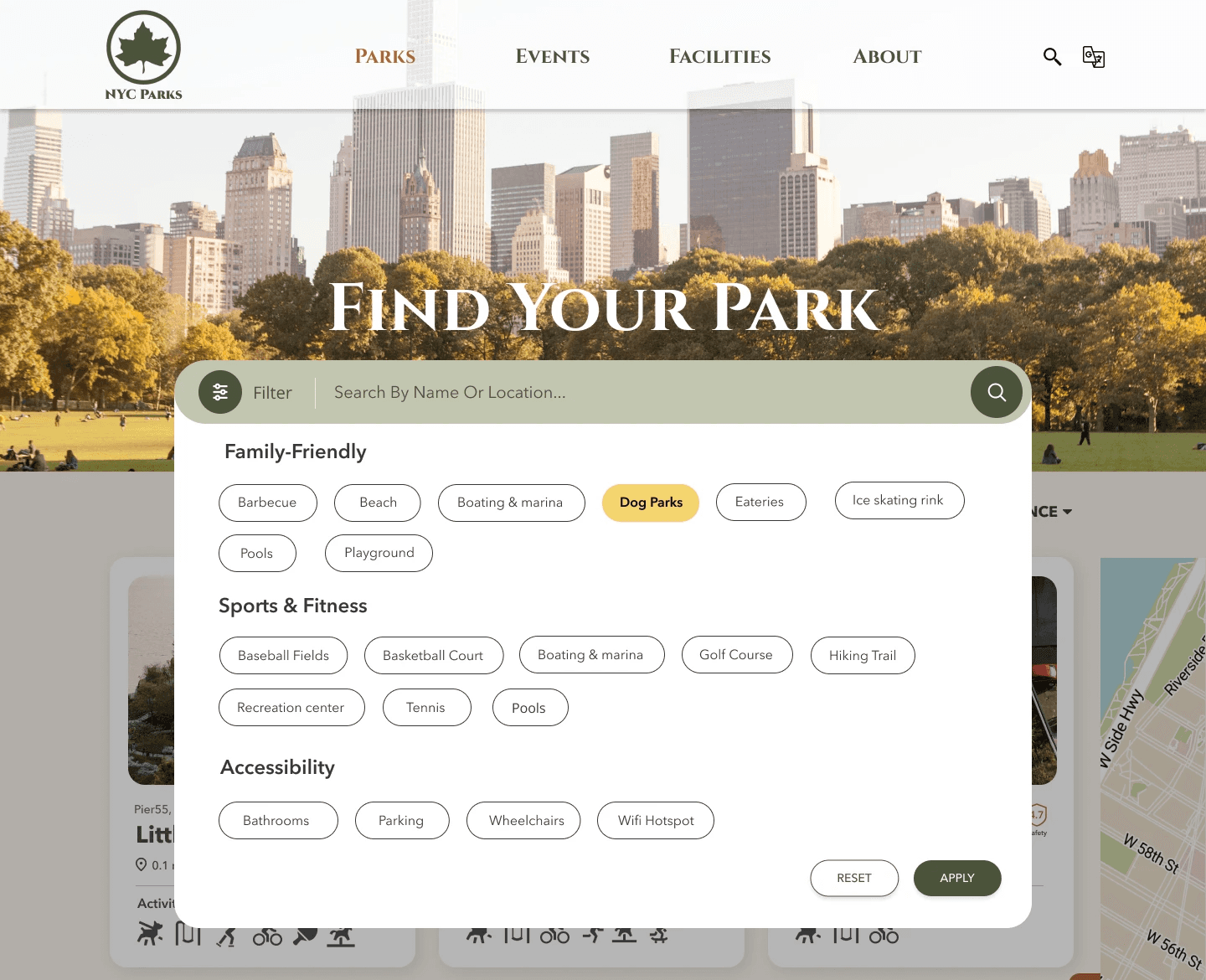
Based on user testing results, it appears individuals favor filters over search functions. They tend to opt for filtering systems, particularly when they are easy to understand. The completed prototype focuses on the design of the filtering system, with 3 diverse filters tailored to the various functions and content they offer.
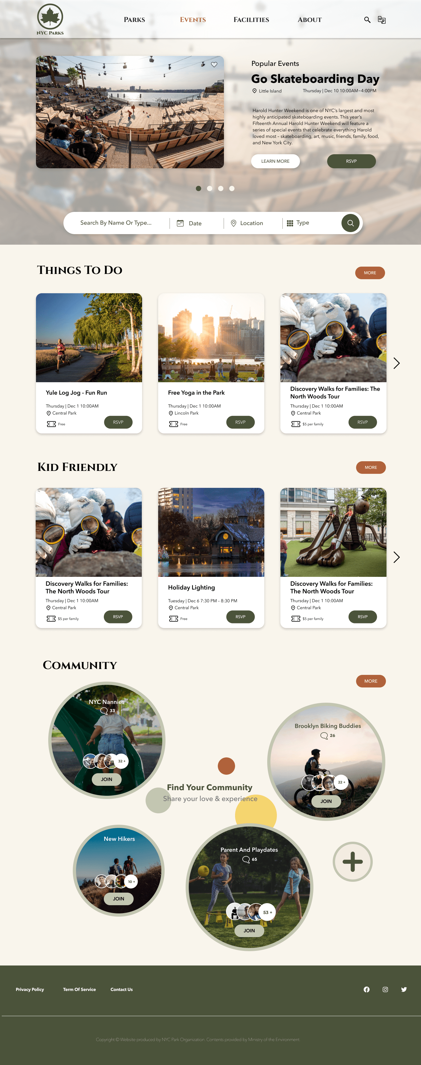
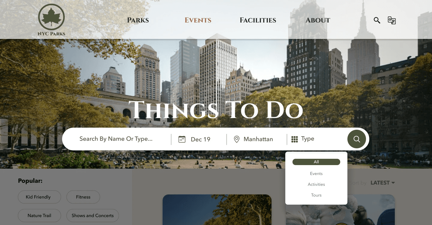
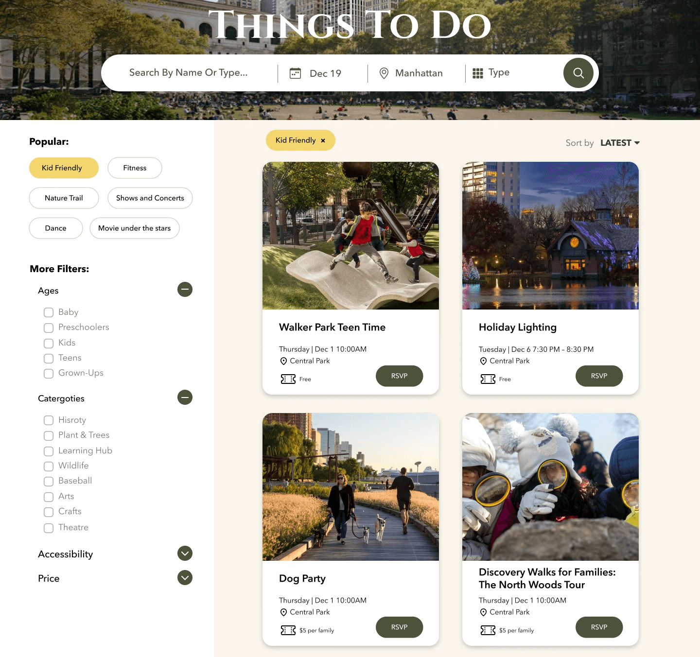
In the Events page, due to the vast number of classifications, a hybrid filter should be implemented. It should have a horizontal layout for date, location, and type, and a vertical layout for easy search of events for different age groups, categories, and prices.
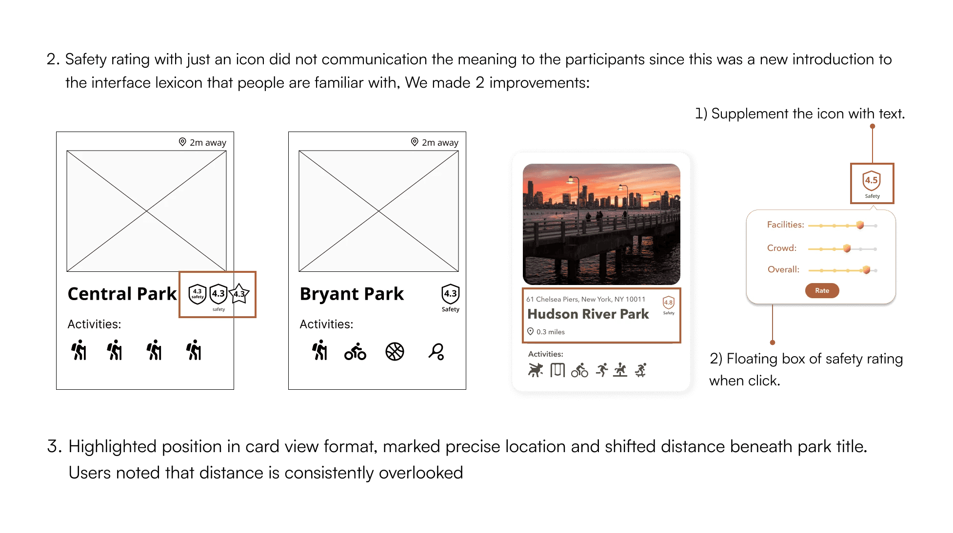
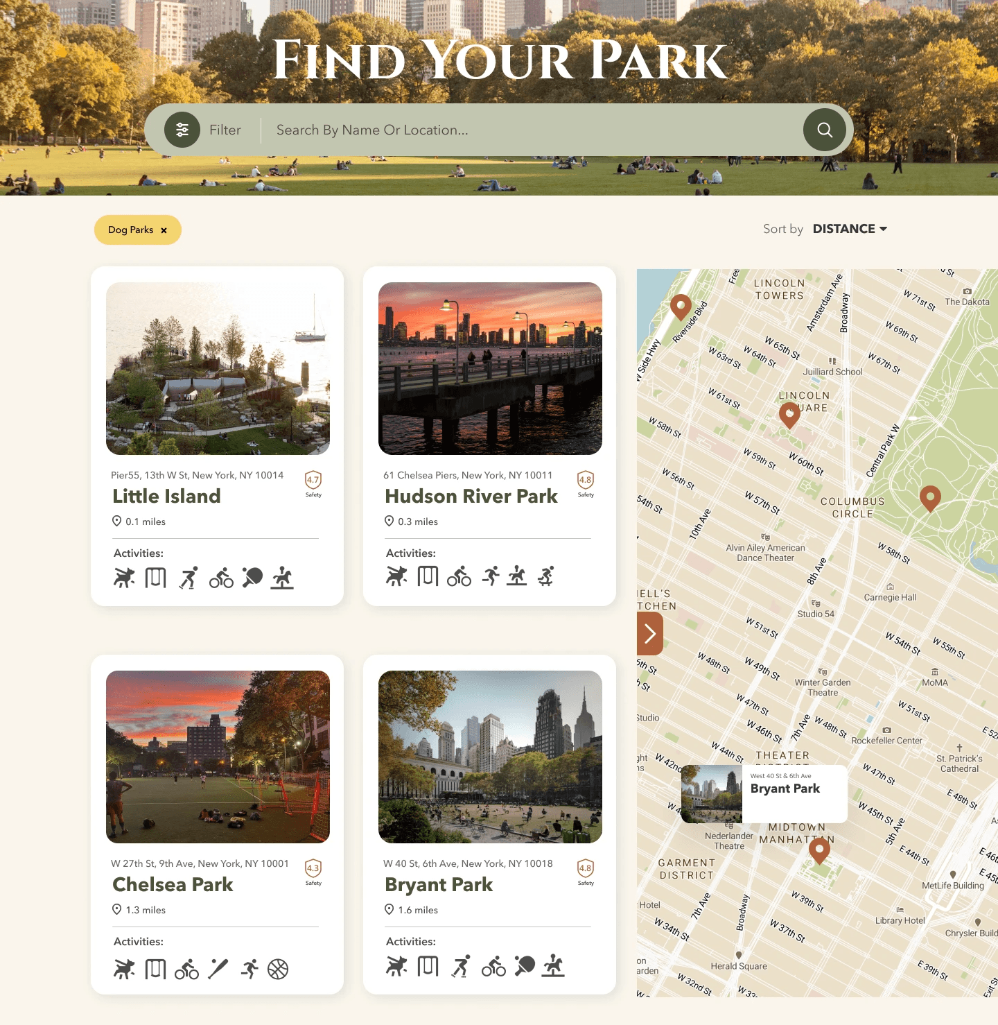
The most important factors when users search for parks are distance and safety. The map is accentuated with park filters and a horizontal filter bar featuring keywords to help users find results directly.
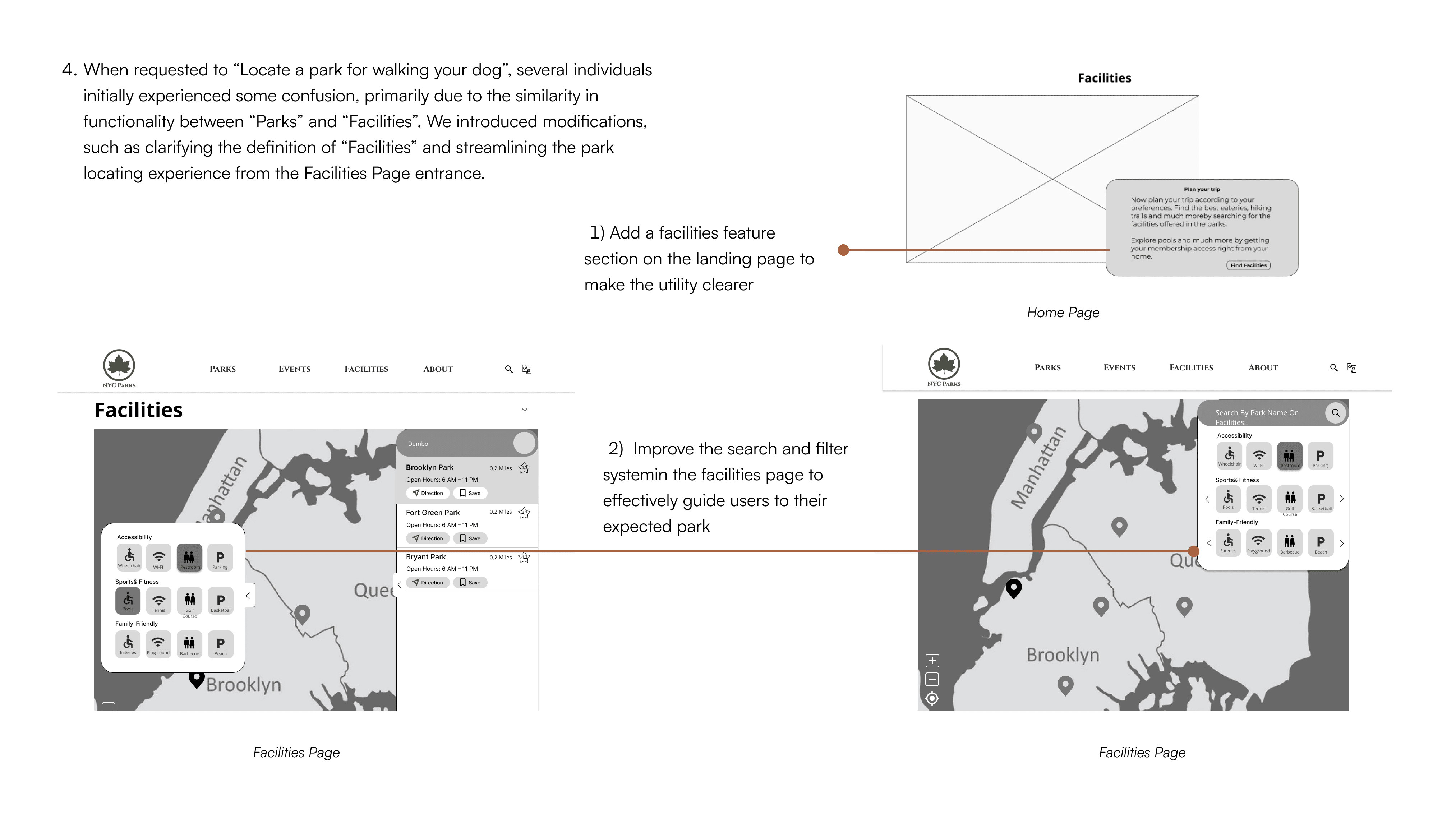
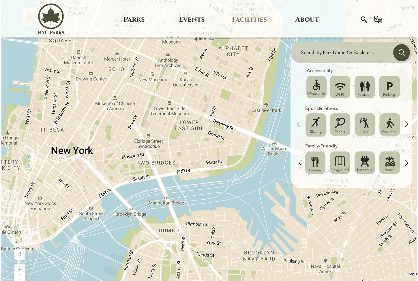
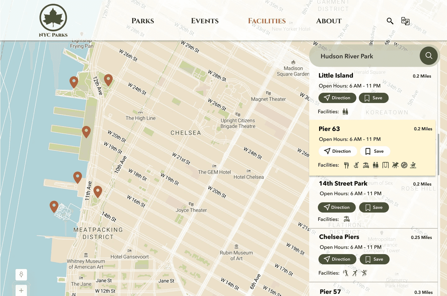
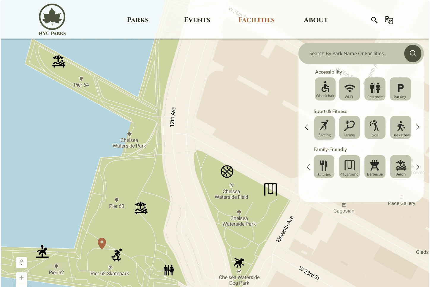
Visitors can find a park featuring their preferred facilities or identify a particular facility's location inside a park. The search and filter bar works with a map with organized filter symbols.
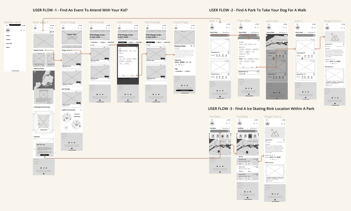
Responsive Design
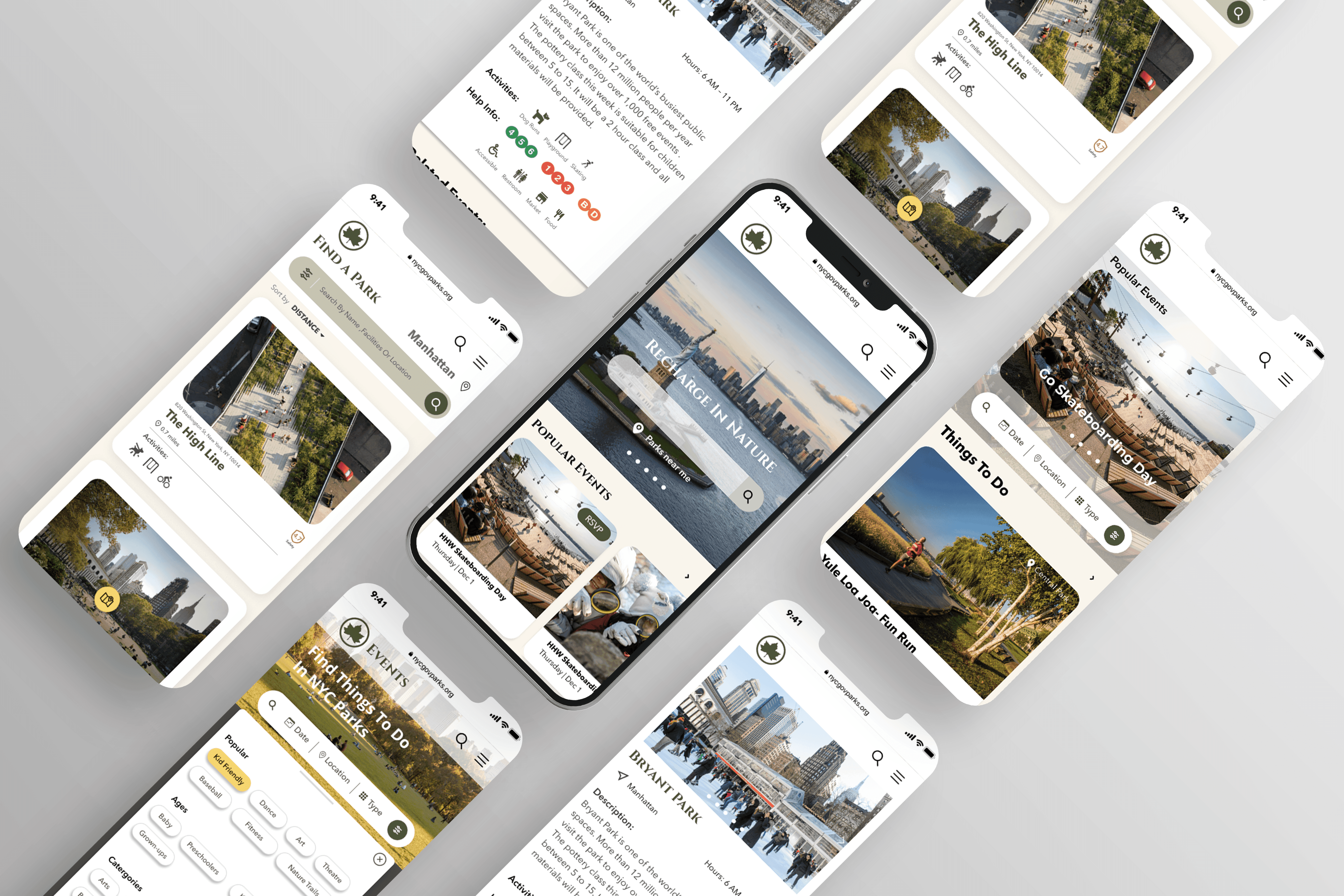
Condensed menu bar.
Enhancing content arrangement.
On event page, streamline filter system.
Employing swipe-ups for sorting options and payment page.
Persistent map button anchored at the bottom, offering location details whenever needed.

